The CPS Annual Regional Analysis (ARA) is a collection of reports designed to inform conversations with communities to address the question - what school options do families and communities need?
The purpose of the ARA is to support CPS’s goal to provide every student with a high-quality education in every neighborhood. These reports aim to ensure that every student in Chicago has access to quality public schools and a variety of programs.
The reports present CPS data in one place, without making recommendations or suggestions for action. They give stakeholders consistent information about school quality, enrollment patterns, school choice, and program offerings by region.
Structure & Organization
The ARA consists of a district report and 16 regional reports. The City of Chicago Department of Planning and Development created boundaries for regions based on housing and employment research. Natural borders such as rivers and train lines divide each region. These borders are likely considerations for families when selecting a school. The ARA uses these regions as they are more consistent than city wards or school networks.
The ARA includes all CPS schools, including traditional neighborhood schools, Charter schools, Selective Enrollment, Magnet, Special Education Specialty, and Options High Schools.
District Reference Map
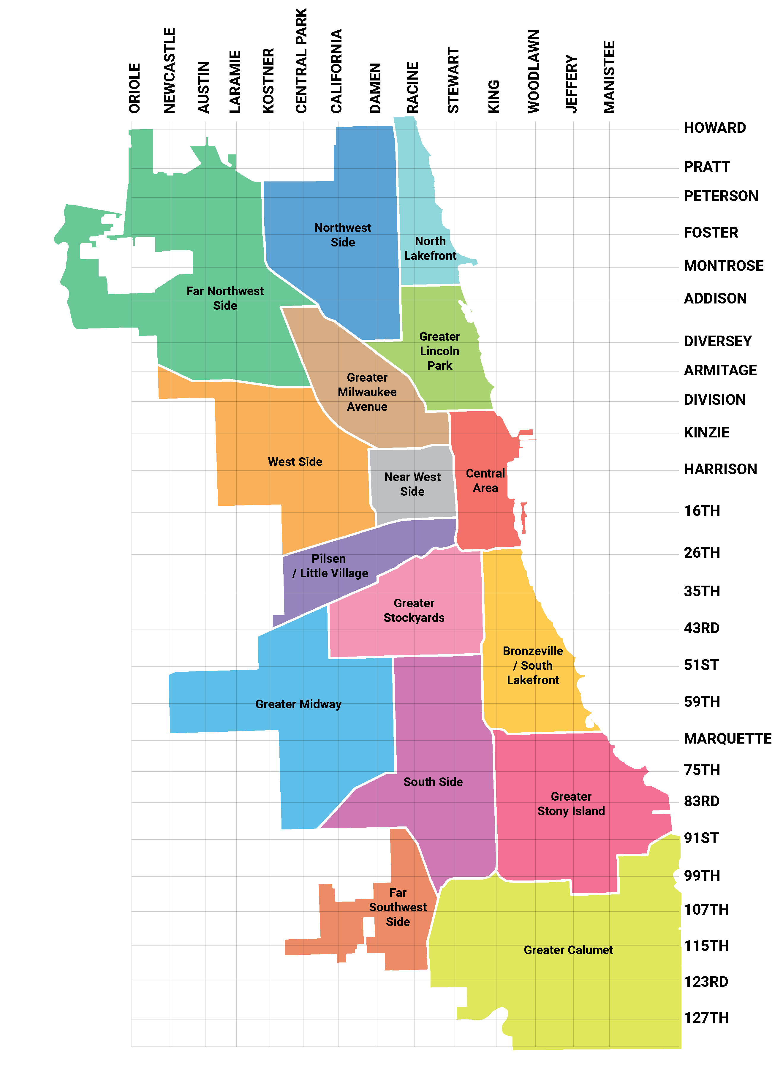
Region Map
The Greater Midway region's boundaries are, generally, West 51st Street, the Stevenson Expressway, and the CTA’s Orange Line to the north; West Columbus Avenue, the BNSF Central Railroad tracks, and Metra’s SouthWest Service Line tracks to the east; and the city’s border with suburban Hometown, Burbank, Bedford Park, and Summit on the south and west.
It consists primarily of seven community areas – Archer Heights, Chicago Lawn, Clearing, Gage Park, Garfield Ridge, West Elsdon, and West Lawn and includes a portion of Ashburn. The region contains medium to low-density residential areas and Midway Airport, for which it is named.
It contains parts of 9 wards, 12 neighborhoods, and 12 community areas. It is served by 4 CTA train stops and 2 Metra stops.
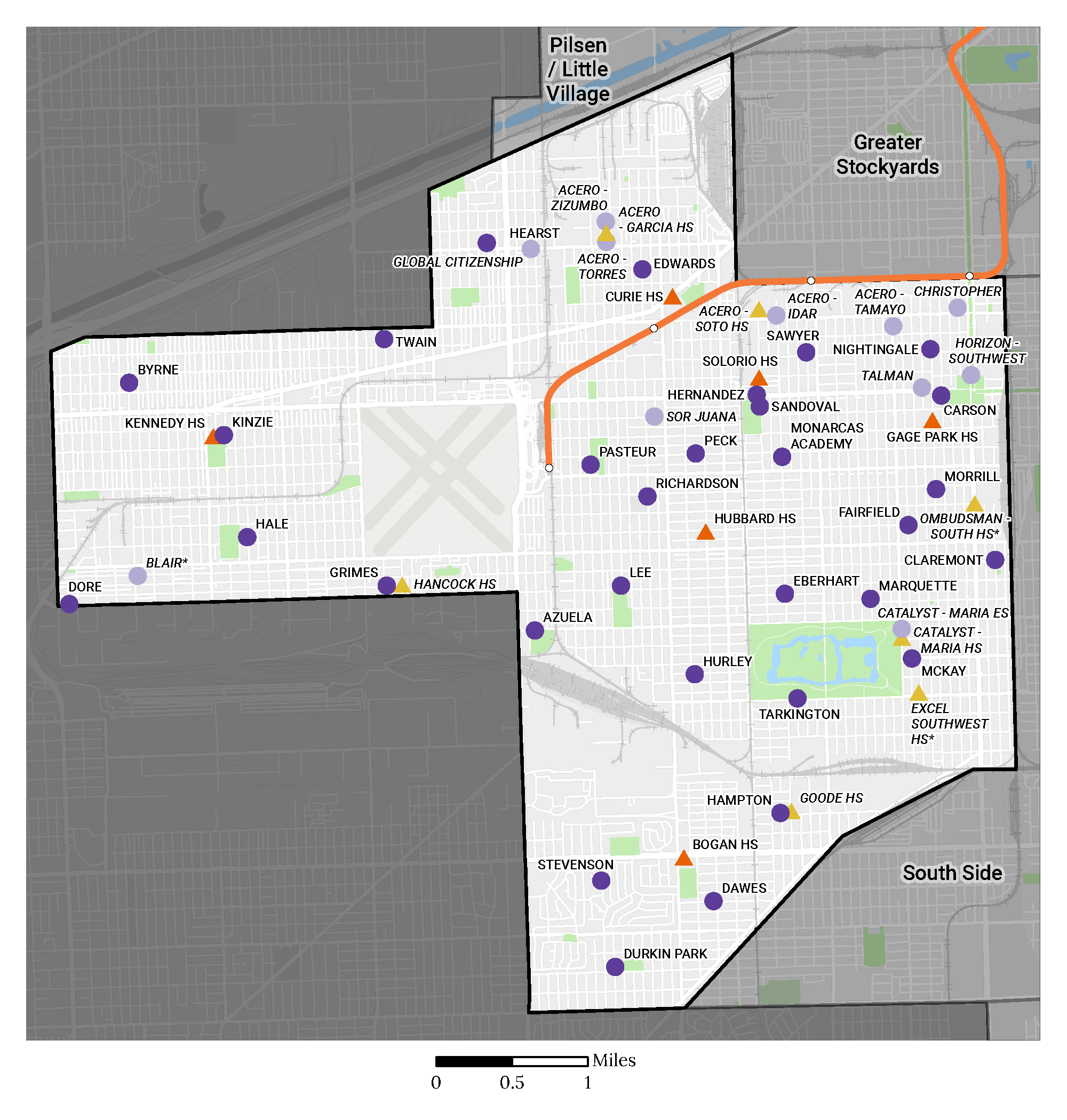
* Denotes Options/alternative or special education specialty school
School Type
ELEMENTARY SCHOOL
HIGH SCHOOL
Demographic Composition
Diversity Within the Region
The following charts use the Simpson Diversity Index, a tool commonly used to measure population diversity based on both the variety of demographic groups and the size of each group.
In the Greater Midway region, the demographic composition of students residing in the region is less racially / ethnically diverse than that of students attending school in the region. At the same time, the demographic composition of both students residing and students attending school in the region is also less racially / ethnically diverse than the district overall.
NOTE: For more information on the Simpson Diversity Index (SDI) and the specific SDI values for the district and regions, see the downloadable data file on the ARA Archive page. Demographic data used in this analysis is from the annual 20th-day count (September 23, 2024).
Racial/Ethnic Composition
In the region's student population over the last four years, the largest racial/ethnic group is students who identify as Latinx. During that time, the percentage of students identifying as Latinx has increased from 85% to 86% while the second largest racial/ethnic group, students identifying as Black, has decreased from 11% to 10%.
The majority of the students in the Greater Midway region identify as Latinx with the southeast portion near the South Side region being primarily students that identify as Black.
Race/Ethnicity Composition Over Time
Race/Ethnicity Composition Over Time
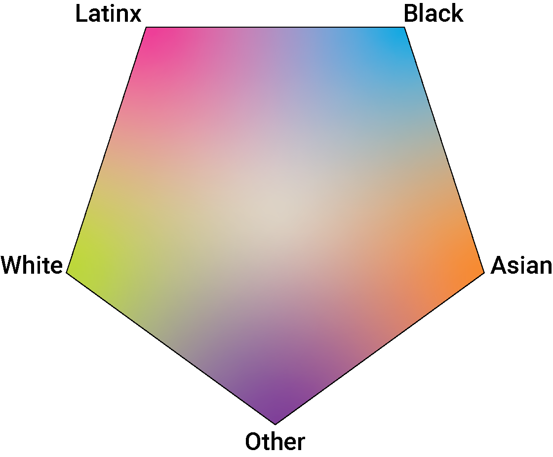
NOTE: This map combines the racial/ethnic identity of students who live in each area (hexagon) of the region. The design of this map protects individual student’s identities while displaying the distribution of race/ethnicity and student density in the region.
The legend shows how the colors associated with each racial/ethnic identity blend together. Areas (hexagons) that show more of one color than another have a higher density of that racial/ethnic identity. Areas with no distinct color are more diverse.
Free and Reduced Lunch Rate
In the past four years, the percentage of students qualifying for Free and Reduced Lunch (FRL) has increased from 78% to 80%. The percentage of students qualifying for FRL in the region remains higher than the overall district percentage of 72%. 1, 2
The Greater Midway region primarily includes areas with medium family income with some areas with higher median income in the western and southern portions of the region and some areas with low median income in the eastern portion.
Free and Reduced Lunch Rate Over Time
Free and Reduced Lunch Rate Over Time
1Before 2015, CPS relied on the Nutrition Services department to administer, communicate, and collect the FRL forms. When the federal lunch program was expanded to all students, CPS needed to administer a separate “Fee Waiver Form” that replaced the FRL form. As fee waivers continue to be collected throughout the school year, the percentage of qualifying students increases.
2FRL data is from the 20th day of each school year. Data from school years 2020-21 and 2021-22 was impacted in part by the COVID-19 global pandemic and the ability to administer and collect FRL forms during remote learning.
NOTE: The Median Family Income map uses annual U.S. Census data collected from all families within each census tract. Median income represents the midpoint, where 50% of families earn more and 50% earn less, providing a more balanced measure of income that is less influenced by extremely high or low values in a given area.
The income categories in this map use the “natural breaks” classification method, which groups similar income values and separates dissimilar ones. This creates a more balanced representation across income categories and more likely reflects how Chicagoans naturally view differences in income.